Best Artwork From Every Pokemon Card Set (Part 2 of 3)
Continuing the best artwork from every Pokemon card set, you will find sets released from 2009 to 2016 here.
This part 2 of 3 articles. View part 1 here, View part 3 here
Use the links below to jump to a particular card series:
1st Place

The gentle moonlight illuminating a majestic Pokemon has to be admired here.
Runner-up

I like the sense of despair and entrapment the cave provides while sucking you into the globular artform.
1st Place

A beautifully done flame on a slightly different take on Rapidash than previously seen.
Runner-up

The blue haze and holofoiling accentuated by the light shining from above just looks cool.
1st Place

Fish eye lens causing the horizon to fold on itself is very unique. Was this because of the fish-like Pokemon? I like to think so.
Runner-up

Bold lines, motion blur, and holofoiling that is jumping off the page, set this card apart.
1st Place

One of the more unique art styles, I like the wisping leaves, some of which look like Chinese dragons to me (top right).
Runner-up

Very cool holofoiling that melds flames with gem like sparkles and shapes.
1st Place

I cant say I am a fan of any of the artworks in this mini set. With that said Zapdos is the best of them.
Runner-up

Just terrible. I contemplated whether or not I should include this set at all.
1st Place

This is technically two cards, but it is one artwork, and it is beautiful. The first time artwork has truly spanned two cards (there have been others before but those were more background-esque).

1st Place

The shattering glass holofoil by Hitmonlee’s high jump kick is utterly beautiful, I wish they would do more broken or stained glass looking cards.
Runner-up

Bruce Lee was always cooler than Jackie Chan (though Jackie is way funnier) and that is why Hitmonchan came in second this time.
1st Place

Back to the two card spanning artwork but this time with double the legendary Pokemon! I love this style.
Runner-up

The sweeping lines of Suicune are always beautiful, especially when they can span two cards.
1st Place

I know I know another two car spanning artwork with legendary Pokemon, but they are just so cool.
Runner-up

A very unique art style that looks as if it was painted on burlap.
1st Place

Good and evil, dark and light, its an easy dichotomy and why these cards work so well.
Runner-up

Electabuzz artwork has really evolved over the years to make him leaner and angrier, though still as belligerent as before.
1st Place

The Call of Legends set has some of the best overall artwork of any set. Definitely check it out. With that said I had a hard time picking a favorite, there easily 20 cards that could be here.
Runner-up

The mix of ultra-realism and slightly cartoonish works so well here. I also like the abysmally milky blue pool Tangela is sticking its vine into.
1st Place

Almost monochromatic, the silver highlighting really comes through.
Runner-up

Unlike the Zekrom card I wish they had found a way to not have the fire energy symbols. I feel like they take away from the art.
1st Place

Splashes of color and a dash of acid make this a trippy galaxial encounter brah.
Runner-up

Electricity lends itself to coolness so well. I like how the electricity changes colors and wraps around the frame.
1st Place

I cant decide if I like the pixelated background on these promos. If nothing else they are different and I do like that.
Runner-up

The pixelated background seems to work well with this card and the water droplets.
1st Place

This entire set was not very good overall, though Ferrothorn looks pretty cool here.
Runner-up

Pokemon in action are always cooler than stationery ones.
1st Place

He has a goofy face in this card but the fire encircling Simisear is really cool.
Runner-up

I love the background of fractional metal that really offsets the blue of Cobalion.
1st Place

Shaggy billowing fur in the arctic water is well done in this artwork.
Runner-up

The explosive plasma and psychic attacks launching off the card make Mewtwo intimidating.
1st Place

Obscured face and darkness enveloping all around this card is what the set was named after.
Runner-up

Often times they make Groudon look like a lumbering beast, but here he is nimble and vicious, a welcome take on the legendary.
1st Place

Rayquaza is an inherently cool Pokemon so he gets in by resting on his laurels. Im just not a big fan of the computer generated look that this set had lots of.
Runner-up

This set overall was a little disappointing to me. Lots of artwork that was cool but not quite great, this is a good example.
1st Place

I love the half graffiti half tie die background. This is a mini set of 21 cards so choices were limited.
Runner-up

Swirling vortex of fire, lightning, and plasma are super cool here.
1st Place

The shimmering and reflective water placidly outlining this adorable Pokemon is breathtaking.
Runner-up

Aside from the stoic and virile stance of Scyther, I like the wavy grass highlighted by the sun.
1st Place

The combination of the plasma logo and Lugia’s stance with blue electricity is stunning.
Runner-up

You may view this as an odd choice given the rare and powerful Pokemon found in this set, but the coloring and shading drew me in.
1st Place

Swirling colors and one of the many arms that provides a solid backing for the text of the name make this the best artwork of this set.
Runner-up

Most cards in this set depict a world being frozen over. The frostbitten apples are my favorite take on this concept.
1st Place

Effervescent colors spouting from the splashing paws of legendary beast, stunning.
Runner-up

Parental love on a beautiful day in the meadow. So much joy is brought by this.
1st Place

So many shades of blue Seismitoad is camouflaged, yet easily distinguishable.
Runner-up

A totally different art style than what we normally see in Pokemon. I love the darkness and realism.
1st Place

I like the purple and blue coloring accented by particle explosions.
Runner-up

Swirling rose petals still can’t make this Beedrill cute. It is always been one of scarier Pokemon from the anime when the characters encounter one in the woods.
1st Place

A total bad ass card. Pikachu is typically so docile and playful, but here he isn’t taking crap from anyone.
Runner-up

This card just keeps on giving. It took me awhile to notice the fisherman in the background trying to reel in this monster.
1st Place

The purple Rocky Mountains, they are beautiful no matter where you see them.
Runner-up

He looks innocent and friendly but he will steal all of your belongings so watch out.
1st Place

I feel like you either love or hate the Japanese text exploding out of the artwork. Personally I love it and think it adds something new to Pokemon cards.
Runner-up

One of the more simplistic artworks in this set, yet one of the most beautiful. I love the camera flare effect and the highlighted flames.
1st Place

Still not a fan of the pixelated background on these promos, but Rhyhorn looks super cool here.
Runner-up

Maxin out relaxin, Meowth is on a much deserved vacation.
1st Place

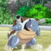
There are simply not enough cards featuring Pokemon in battle. Seems odd to me given that is the main premise of the Franchise.
Runner-up

Every time I see Electabuzz I hear is garbled scream from the anime.
1st Place

I love the ghoulish graveyard setting. I hate the Pokemon.
Runner-up

The last few sets have featured the Japanese words alongside the artwork for the EX cards. This one was the best of the lot.
1st Place

Magcargo finally got a good looking artwork, all the previous versions were lame. I like the different colors representing heat.
Runner-up

Looks like the beginning depths of the Mariana Trench and this dragon Pokemon lies in wait.
1st Place

You really get that sludge, low viscosity, stank feeling from this Grimer.
Runner-up

I like to see Pokemon fighting and artwork like this is special because of it.
1st Place

Evil juxtaposed with children’s toys is well done here.
Runner-up

It is crazy what lighting will do. If this was more fully lit it Exeggutor would have a fun looking disposition.
1st Place

This artwork almost has a classical vibe mixed with religious reverence.
Runner-up

The flames look as soft as the fur of Flareon.
1st Place

By far the most unique artwork of this set. I’m not sure any other Pokemon could pull off this look.
Runner-up

Free spirited and dancing, you can feel the atmosphere of this party.
1st Place

He is either running very fast or so sow that the camera was able to capture the movement of the stars.
Runner-up

Swirling and churning seas mastered by Golduck.
1st Place

Ultra cute Flareon, but the hearts scattered all over the card make this unique.
Runner-up

I like the fusion of the black and white, blue and green.
1st Place

A downtown street that has been overrun by growth and Omastar, so cool.
Runner-up

It appears as if Lugia is circling out of the depths of a watery hell, maybe to calm the legendary birds down?
1st Place

I like what they did with the smoke and obscuring different parts of the Pokemon.
Runner-up

Dusk, multiple Pokemon in the background, and a wispy fiery breath.
1st Place

Mewtwo is the classic hero/villain, it just depends on which side you are on and how things change over time.
Runner-up

Usually the primarily gold colored cards look a little off, but this one looks great.
Hopefully you enjoyed viewing some of the best artworks Pokemon has ever done. If you would like to view the latest artworks, this is part 2 of 3 articles. View part 1 here. View part 3 here