Best Artwork From Every Pokemon Card Set (Part 3 of 3)
Continuing the best artwork from every Pokemon card set, you will find the latest sets to be released here.
This part 3 of 3 articles. View part 1 here, View part 2 here
Use the links below to jump to a particular card series:
1st Place

I really like the motion blur and gleaming horns.
Runner-up

This Primarina’s chance to shine and not be made fun of for being the worst final evolution water starter in the games.
1st Place

The stained glass look is so unique and it turned out beautifully. One of the best artworks in all of the series.
Runner-up

The shimmery background amid the rays of light plays well with the guardian of the forest and the giant sentient flower Pokemon.
1st Place

I like the mysteriously blackened facial features diving into the depths of the unknown.
Runner-up

The fore/background are the portions of the artwork I like, particularly the silvery grass.
Runner-up

The pixelated background works well here as if it is refracting light underwater and making things hard to see.
1st Place

Light coming through the tree canopy and illuminating the forest floor is stunning here.
Runner-up

The artist did a great job of directing fire around Heatmor to make a chaotic scene.
1st Place

This remind me of sweeping Italian fields of grain back-dropped by a sunset.
Runner-up

The style of dark almost smeared blacks is very unique here.
1st Place

A sense of realism mixed with fanaticism and a grunge of back alleys is so cool.
Runner-up

Aside from being a cool Pokemon, this artwork captures the playful and hatred sides of Marowak.
1st Place

This is something that simply looks so real to me that I have to seriously question my ability to remove myself from the Pokemon world.
Runner-up

Each egg has a distinct personality that is wonderfully captured.
1st Place

An artwork style that is drastically different than the others, and it looks beautiful. Easily the best artwork of this set.
Runner-up

With a neck that long its no wonder Exeggutor spends so much time with its head in outer space.
1st Place

Finally Slugma is drawn as it should be, like magma dripping down a volcano.
Runner-up

The colors are so eerie and since this could be something in real life it makes it all the scarier.
1st Place

You can feel the power of the electricity blowing up the planet!
Runner-up

I like the shading that is all over the slippery scales of the this water dragon.
1st Place

The aqua background contrasting the red and black flames that frame the Majestic Moltres are inspiring.
Runner-up

Unique art style, I like the flowing fur and pink flames.
1st Place

Back to back first places for Moltres. The fire for its wings is spot on for how it would look in real life.
Runner-up

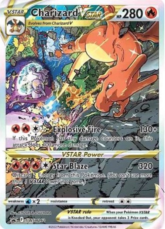
The curvature of Charizard’s wings and how they encircle him while shooting out fire is just cool.
1st Place

Realistic Jigglypuff singing in a karaoke bar and putting people to sleep only to get mad at them, need I say more.
Runner-up

This scene in the move was pure and memory inducing.
1st Place

It feels like the LA streets in the summer, maybe Rodeo Drive? You know these guys are not welcome down there.
Runner-up

I love the mini fists that Marshadow is making to go with Machamp’s big fists.
1st Place

Sableye munching on gems and Tyranitar throwing a fit about who knows what looks great with all the bright colors.
Runner-up

Looks like Mewtwo has broken out of the cloning tank, maybe Mew helped him?
1st Place

Not quite as cool as the stained glass Legendary Birds card from the promo set, but still a stunning card.
Runner-up

Not many trainer cards make the top two, but these two classic characters are just so lovable.
1st Place

The Character Cards from this set have some of the best artworks ever. I love the trainers interacting with their Pokemon!
Runner-up

The juxtaposition of the huge menacing Steelix and the small girl commanding it is beautiful.
1st Place

It may just be a Torterra sleeping on Snorlax’s stomach, but the colors pull you in and make you think you are inside your own private terrarium.
Runner-up

Anytime the artist can give the appearance of water while still maintaining its transparency I am impressed.
Runner-up
This card has a sister card showing the battle from the Mewtwo’s side. Very cool when they do this. Check it out here.
1st Place

I love the magma with a globular look. Typically you get fire that is lashing out but this feels more like a slow hot burn.
Runner-up

Ninetales is inherently beautiful and the purples and reds blend so well together.
1st Place

Majestically looking off into the distance this could easily be an album cover for an alternative rock band.
Runner-up

It is nice to see Pokemon relaxing sometimes, and the shadows from the tree on Ampharos’ belly lull you to sleep.
1st Place

I feel completely immersed in the scene of a run down fighting gym.
Runner-up

It really feels like Ekans is coming at you from the shady tree tops.
1st Place

Very good use of differing colors for the electricity.
Runner-up

I don’t usually like when the pokemon does not fit into the background, but this one seems to work. I like the bleeding the picture box of all the colors.
1st Place
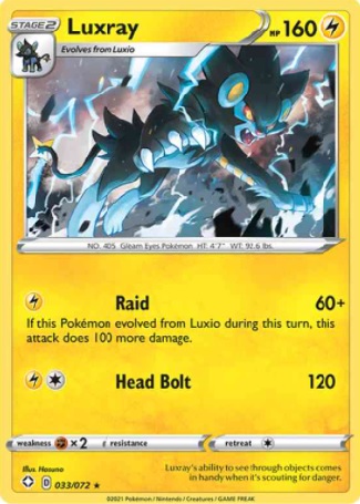
I love the way the blue lightning streaks across alongside Luxray’s menacing face.
Runner-up
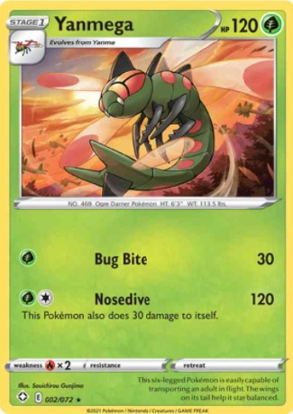
I get the feeling of distortion from the wind beating off its wings.
1st Place
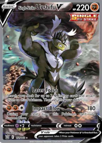
The Battle Styles set brought some unique illustrations that feel very different from any other set thus far. This is a prime example.
Runner-up
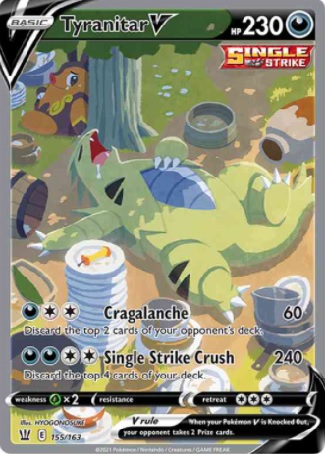
When the artist draws Pokemon in a natural setting or at least something that is not fighting I have a soft spot for that.
1st Place
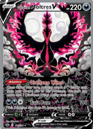
The grayscale background contrasting with the red and pink flames is just cool. I like how as you look longer at the art you notice little things like the eyes in forest below.
Runner-up
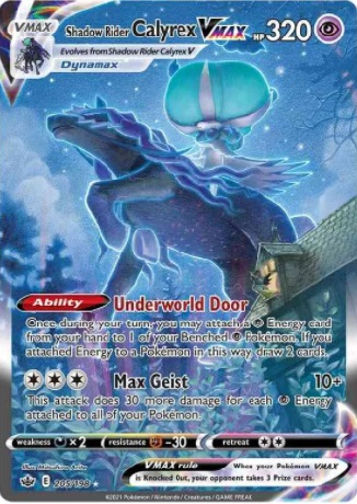
The upward angle juxtaposed against the house to show how large the creature is plays well with the icy blue color scheme.
1st Place
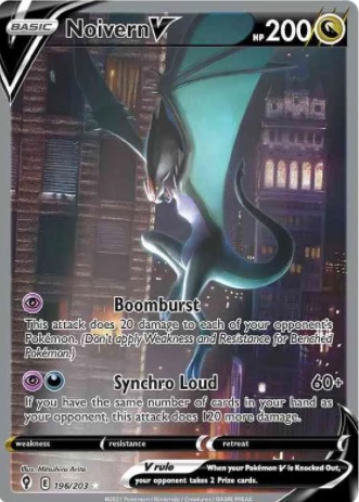
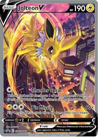
This has a Batman in Gotham City vibe. You don’t tend to see Pokemon depicted in a cityscape very often.
Runner-up
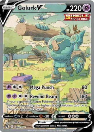
A different art style than what normally appears on this list. I like seeing the constructive side of Pokemon opposed to the destructive side.
1st Place

A classic, surfing Pikachu, its light hearted and fun.
Runner-up

Almost feels like an ancient drawing that has been restored after years of being kept in a vault.
1st Place
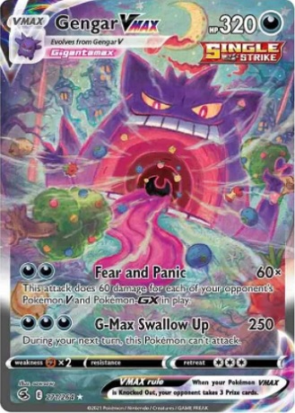
Some of the Gigantamax Pokemon are a little ridiculous but Gengar has always been comical and a jokester. Seeing him inhale all that stuff is plainly fun.
Runner-up
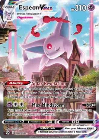
I love how even a giant Pokemon can look calm and non destructive as it takes a cat nap on the building.
1st Place
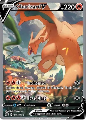
I wish there were more cards displaying Poekmon battles like this.
Runner-up
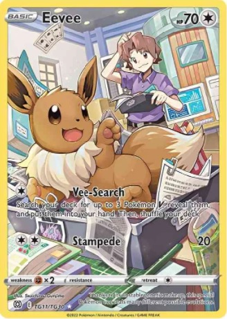
Eevee’s playfulness really comes through with this artwork.
1st Place
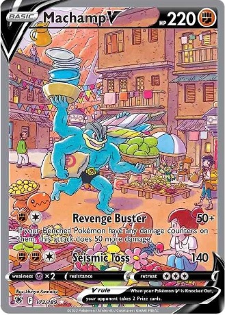
Everyday life depictions of Pokemon are great, especially ones showing the utility of a fighting type like Machamp.
Runner-up
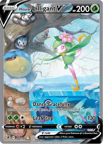
I love that there are so many different Pokemon shown in this scene.
1st Place

When the Pokemon Go app was launched this was the image everyone had in their mind.
Runner-up

I wish they would have done more artwork like this showing “in game” photography.
1st Place
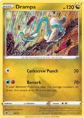
It feels like a fine art portrait that belongs in an art museum.
Runner-up

This is how Bob Ross would have painted a happy little Pikachu
1st Place
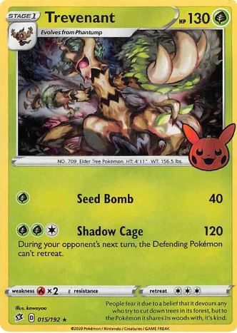
His beckoning wave makes me think of Neo in the Matrix
Runner-up

Mewtwo looks like he is in a 4th dimensional box that is tearing space and time apart.
1st Place
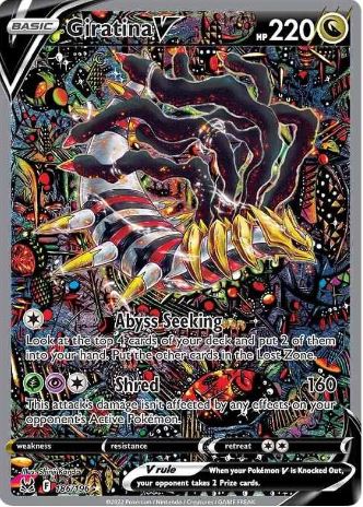
I love how chaotic the shadow realm appears with its vibrant colors and swirling perspectives.
Runner-up
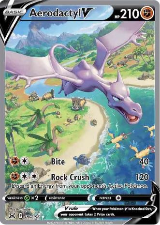
I have a soft spot for artworks that show Pokemon in a natural habitat, especially if there are multiple Pokemon types in it.
1st Place

The color scheme and upward angle showing just how huge Lugia is relative to the boat and captain is mesmerizing.
Runner-up

Milotic is said to be the most beautiful Pokemon. The light and water droplets of this artwork help bring credence to that statement.
1st Place
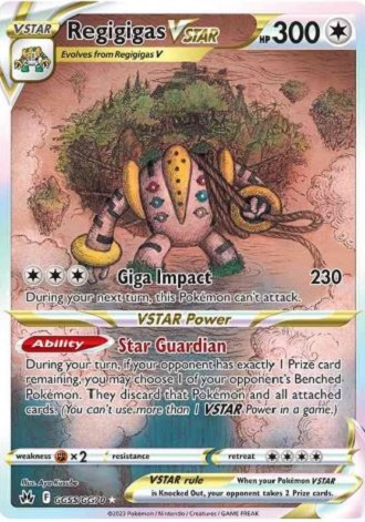
I like the vague penciled artwork showing Regigas towing a floating world through the ocean.
Runner-up
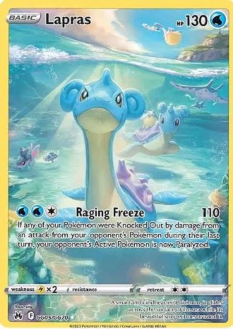
I am sucker for underwater scenes and scenes showing multiple Pokemon interacting in a habitat.
1st Place

Using Pokemon as rugs and chew toys is a very creative way of intermingling different species of Pokemon.
Runner-up

The color scheme of the dust devil matching the Pokemon is fantastic.
1st Place
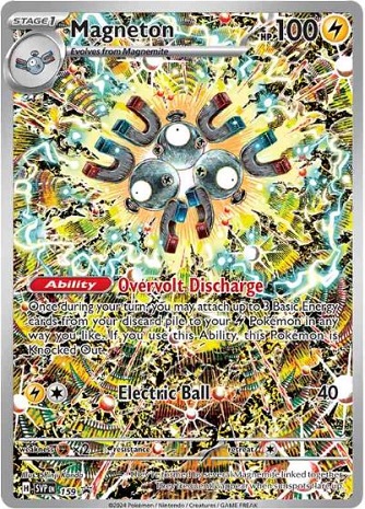
A similar style the Umbreon in Prismatic evolutions. There is just so much to look at.
Runner-up
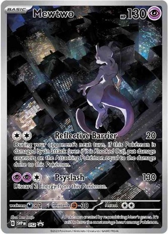
I see now that the circumstances of one’s birth are irrelevant. It is what you do with the gift of life that determines who you are.
1st Place

The feeling of mysticism between the black background and rushing water really makes the Magikarp vibrant.
Runner-up
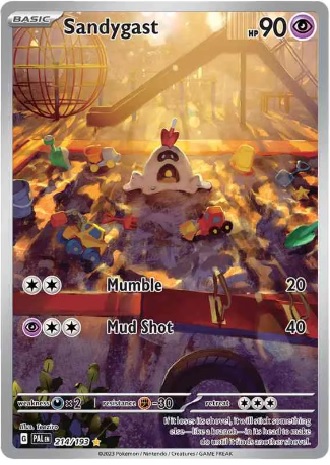
Pokemon in real world situations are just cool, and this one with the children’s toys in on spot.
1st Place
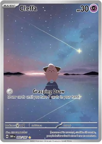
Its simplicity is beautiful
Runner-up
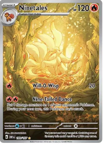
The center is so bright that it draws you in and commands you study it.
1st Place
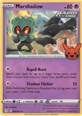
Both of these cards are found in previous sets. The small card count of this set gives some cool artwork a chance to shine.
Runner-up
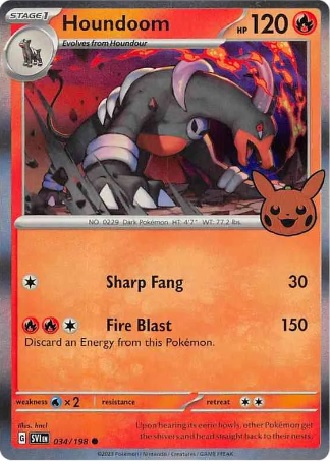
The wispy lines make you feel the energy.
1st Place
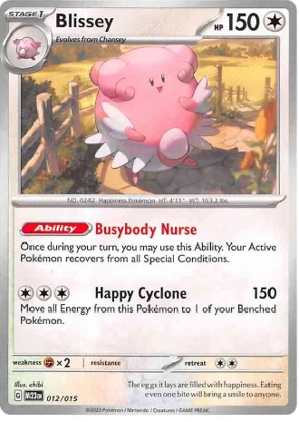
I like the shadowing on this card.
Runner-up

The perspective of the flowers and the pokemon is well done.
1st Place
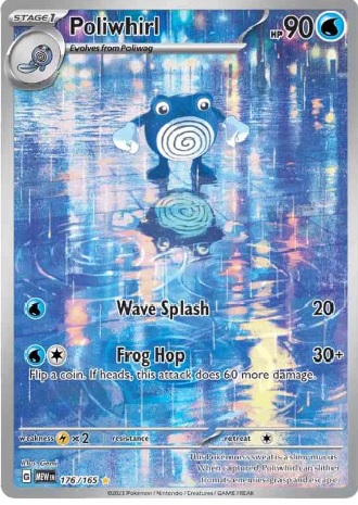
Reflecting water on the street is common yet unbelievable.
Runner-up
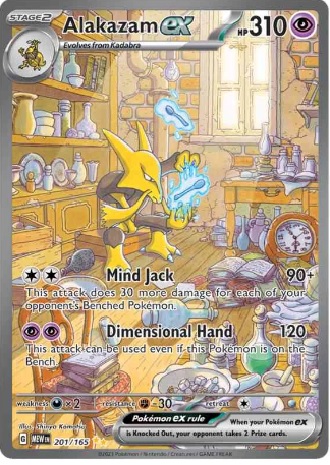
I can see Alakazam emerging itself into its apothecary work.
1st Place

I get a Blair Witch Project vibe from this. A felling not often found in Pokemon art.
Runner-up
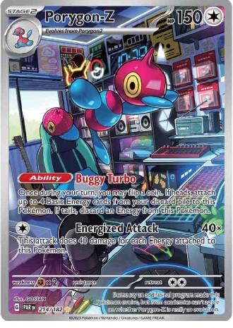
The theme of the room fits perfectly with story of Porygon-Z.
1st Place

The serenity and flow of the movements really draws you in.
Runner-up
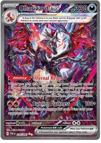
It has the stained glass quality that I really like.
1st Place
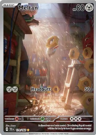
A metal pokemon in a metal working shop fits perfectly. I like the sparks providing lights for the image.
Runner-up
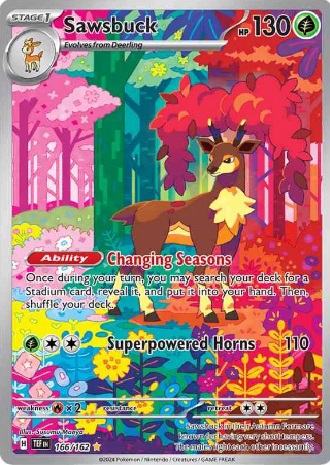
This card has sister card of Deerling that flows into the artwork. Showing the seasons and variations of Sawsbuck is very well done.
1st Place
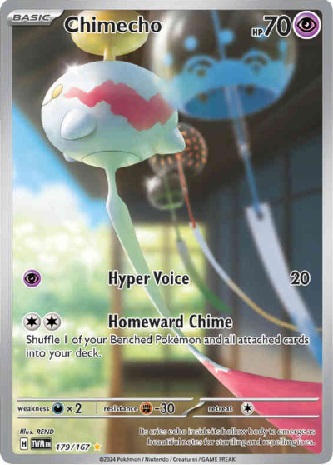
It is very cool to see the inspiration behind the Pokemon.
Runner-up
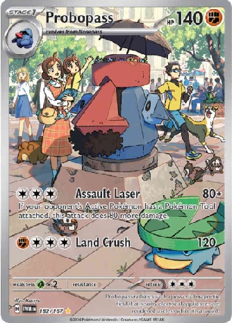
I am assuming that Probopass is a street performer. I love the interaction with the child.
1st Place
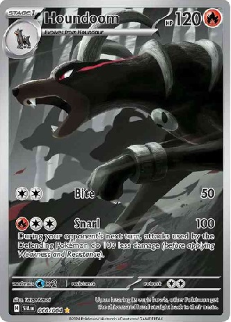
The monochromatic silhouettes in the background give great depth to this artwork.
Runner-up
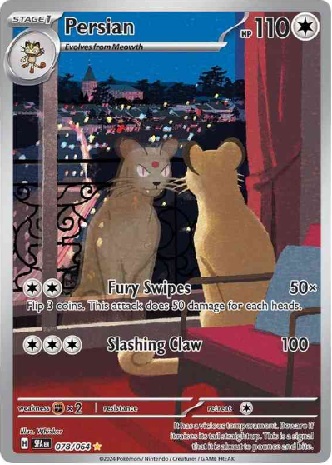
You can feel the superiority of Persian as it waits for Giovani.
1st Place
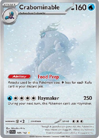
It really feels like its in the correct environment.
Runner-up
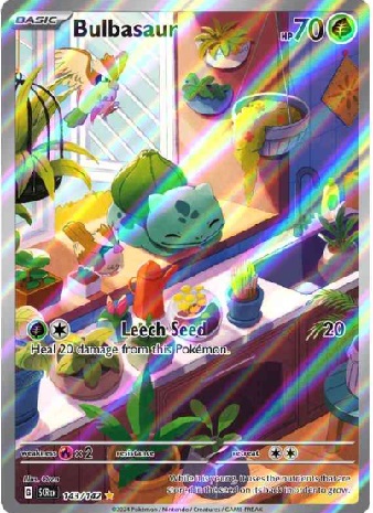
Bulbasaur is like a living house plant.
1st Place

Chromed out Americana from the sixty’s fits well with Skarmory and the desert.
Runner-up
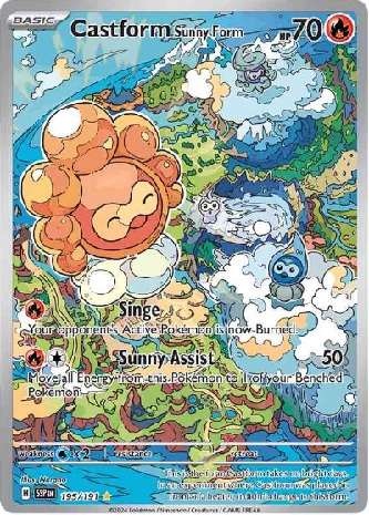
I really like how the took the map of the Paldea region and incorporated the different Castform forms.
1st Place
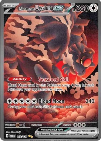
The streaking clouds combined with the snort really got me.
Runner-up
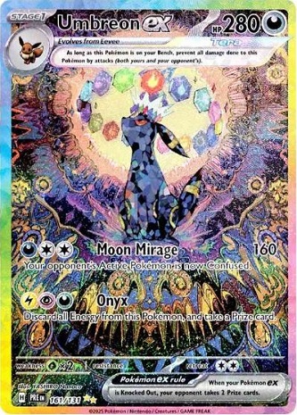
So many psychedelic colors provide a ton to look at.
1st Place
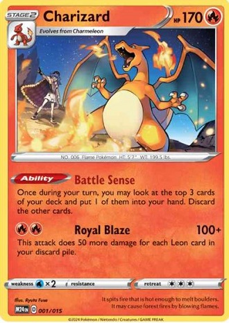
I have a soft spot for artwork with trainers included.
Runner-up
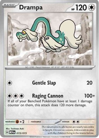
The monochromatic background makes Drampa focally pop.
1st Place
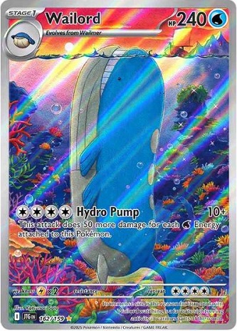
There is something comical yet serene about this big ole whale.
Runner-up
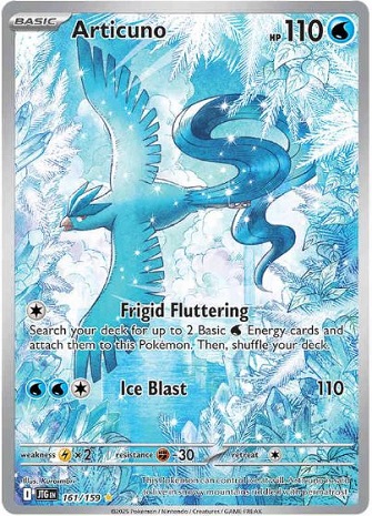
The blues and whites are simply elegant.
1st Place
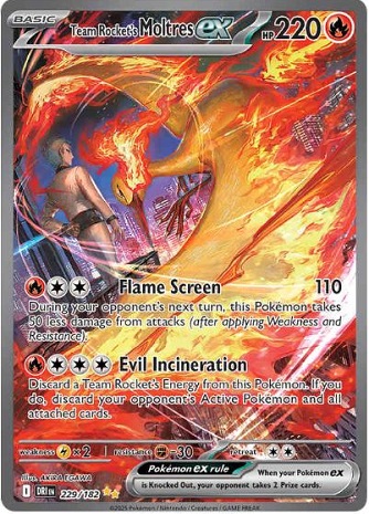
The transparency of the flames revealing the city beneath is very cool.
Runner-up
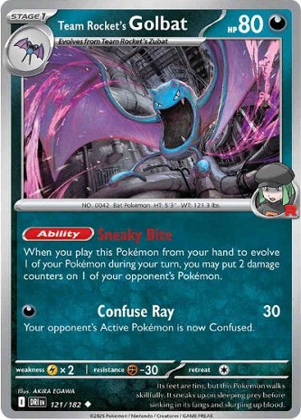
Sweeping lines of the wings and pipes are striking.
1st Place
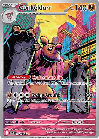
The color pallet paired with working poekmon works well here.
Runner-up
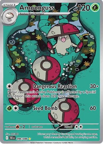
A unique view of pokemon in their natural habitat.
1st Place
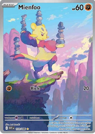
This encapsulates the Mienfoo so well.
Runner-up
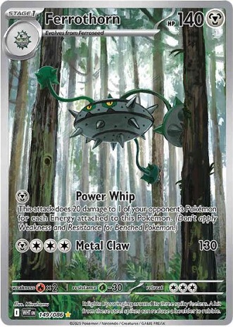
Reminded me of a Star Wars forest
1st Place
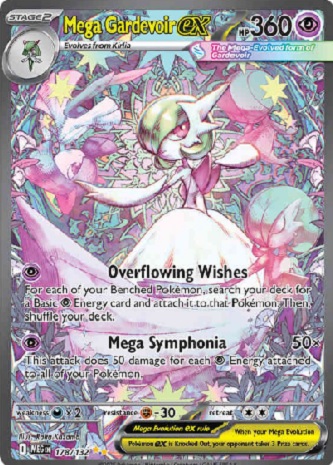
If feels like a fairy tale symphony is swirling around you.
Runner-up
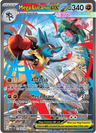
They dont have enough cards like this featuring pokemon battles.
1st Place

This encapsulates the Mienfoo so well.
Runner-up

Reminded me of a Star Wars forest
1st Place
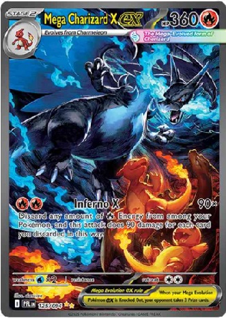
Showing the entire evolution line is really cool.
Runner-up
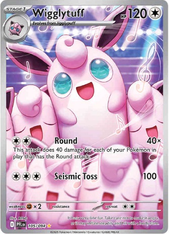
This is happiness.
1st Place
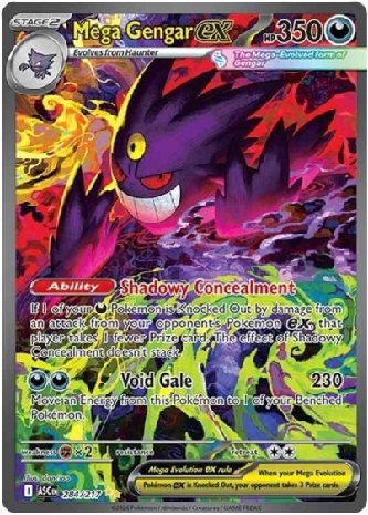
John Wick level cool.
Runner-up
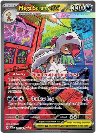
This really fits Scrafty’s persona.
Hopefully you enjoyed viewing some of the best artworks Pokemon has ever done. If you would like to view the older artworks, this is part 3 of 3 articles. View part 1 here. View part 2 here


